No previews. No rebuild. Onboarding for 3,000+ businesses and 10M+ visitors a year.
- SaaS
- Live product
- Self-serve pivot
- Role
- Design LeadSole designer
- Team
- 4 people2 FE · 1 BE · founder
- Timeline
- Dec – Mayonboarding → rollout
- Scope
- Onboardingdesign system · flows · screens
Stride's onboarding worked because a salesperson walked every business through it. That doesn't scale, and the company was pivoting to self-service, so the interface had to absorb everything the human used to do.
I couldn't rebuild from scratch, and I lost the two patterns I wanted most. What was left was structure.
The same onboarding, rebuilt
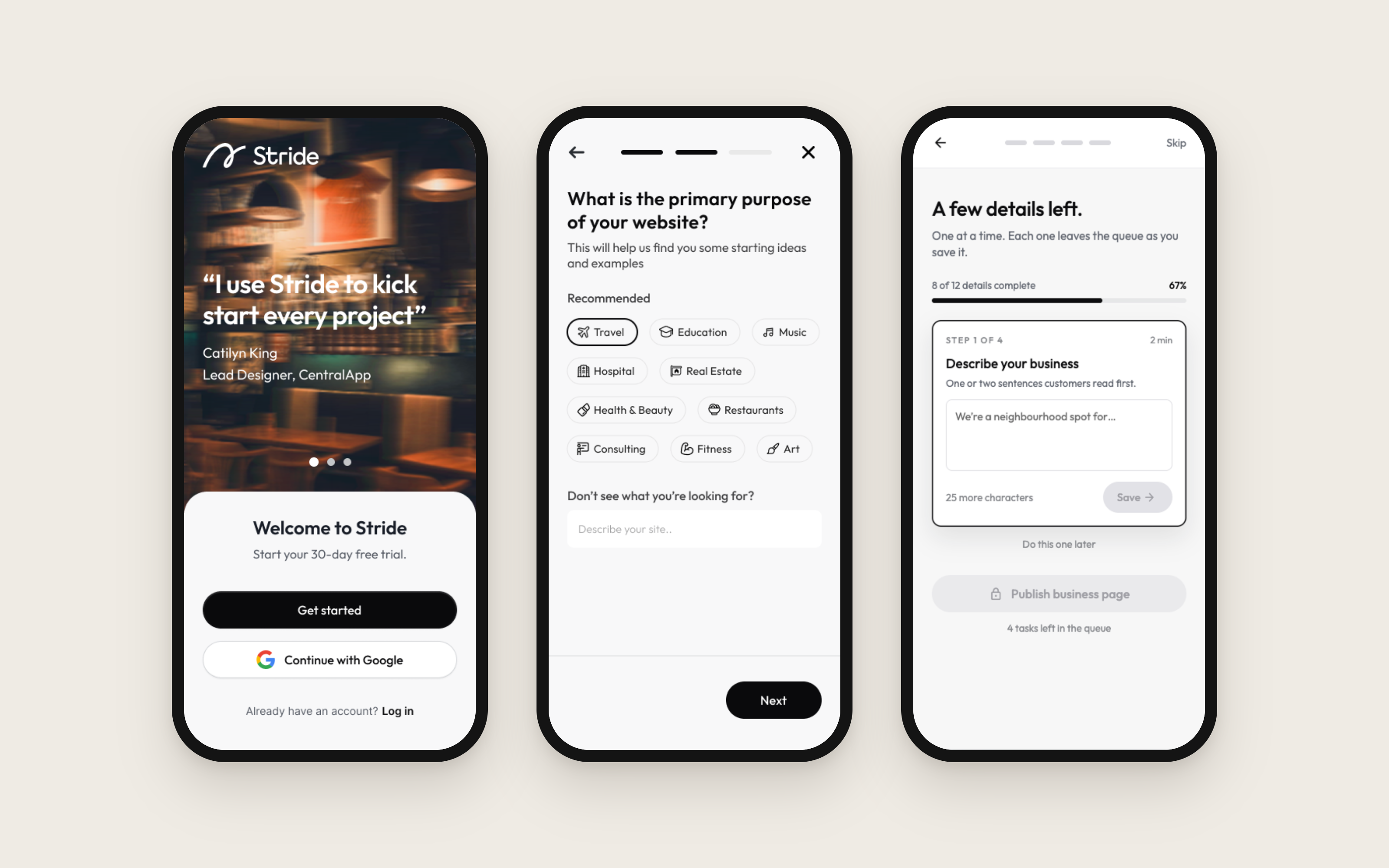
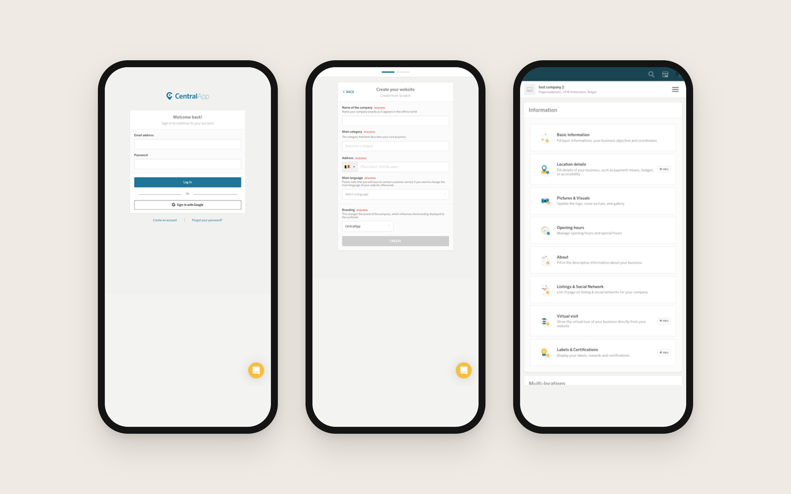 BeforeAfter
A human on every call
Stride serves small European businesses (restaurants, shops, salons) with websites and online marketing. Every new business was onboarded by a person: a sales or customer executive walked them through setup on a call, or gathered their information and filled it in internally. That works until you want to grow.
The company moved to self-service to free the sales team and serve businesses too small to justify a call. I was brought in after that decision was made. I didn't choose the direction, I owned carrying it out.
To understand what the interface would have to absorb, I worked through more than fifteen competitor sign-up flows and spent significant time with the founder, also the technical lead, pulling apart what our own flow quietly assumed a human would be present for.
This wasn't a blank page. Thousands of businesses were already using it.
Nothing happened if you skipped it
The obvious problem was that onboarding needed a human. The more interesting one showed up underneath it.
Onboarding ran in three sub-flows: company creation, onboarding proper, and publish. After the sales call ended, users still had to complete a checklist of required inputs: roughly a dozen fields covering legal information, verifications, social links, branding assets. Almost nobody did.
The reason wasn't laziness or bad copy. You could bypass the entire checklist and publish anyway. So incomplete websites went live, and the cleanup came back as support back-and-forth with the team, the exact human cost self-service was supposed to remove.
The checklist had no consequence attached to it. That was the actual design problem.
What I was designing against
Before any solution, here's what was ruled out. The constraints shaped this design far more than any best practice did.
- Ruled out
Live previews
I pushed hard for showing the website update as users picked a theme: industry standard, and the clearest way to make setup feel worthwhile. Rejected: previews aren't practical on mobile, and scarce engineering bandwidth wasn't going to a pattern most users would never see. I argued that users of competing platforms still get it on desktop and it sets expectations. I lost.
- Ruled out
Gamification
Progress bars, streaks, animation: the playbook for making a long flow feel light. Cut for engineering bandwidth and the cost of reworking existing code.
- Ruled out
Rebuilding from scratch
Live product, live users, ship-in-parts. Every change had to be an upgrade to something that already existed.
- Constraint
Three languages at once
English, French, German simultaneously. A label that fits in one overflows in another, which quietly constrained every element I could use.
What everyone gets wrong about onboarding
Every article, every best-practice doc, every competitor flow I studied (more than fifteen) points the same direction: fewer steps, less friction, get the user through as fast as possible.
That advice was wrong for my users.
Business owners setting up their own website weren't looking for the fastest possible exit. They were doing something that mattered to their business, and they were willing to spend real time on it, as long as the time felt like it was going somewhere. What made them quit wasn't length. It was a screen with five required fields and no sense of what any of them were for.
So I stopped optimising for fewer steps and started optimising for momentum. A longer flow that feels like a sequence of small wins beats a short one that feels like a form.
Three attempts at one button
We kept the option to talk to a human; taking it away would have punished exactly the users who needed the most help. The question was where to put that choice. It seemed trivial. It took three attempts.
The flow
Users
- Attempt 01
Too early
Right after company creation
Setup still looked easy, so users said no, then got stuck alone later.
- Attempt 02
Too late
Near the end of the second sub-flow
The users who needed help had already dropped off.
Always in reach
Not a single screen at all
Help within reach on every step, most of all at the hard part.
Timing mattered more than the button.
What I built
Step 1 of 15: Sign up. Next: Create an account with Google.



Stride's onboarding on desktop as a clickable prototype, walked the way a restaurant owner would: one decision per screen, then the four details a page can't go live without. Each one leaves the queue as it is saved, and publishing stays locked until the last is in.
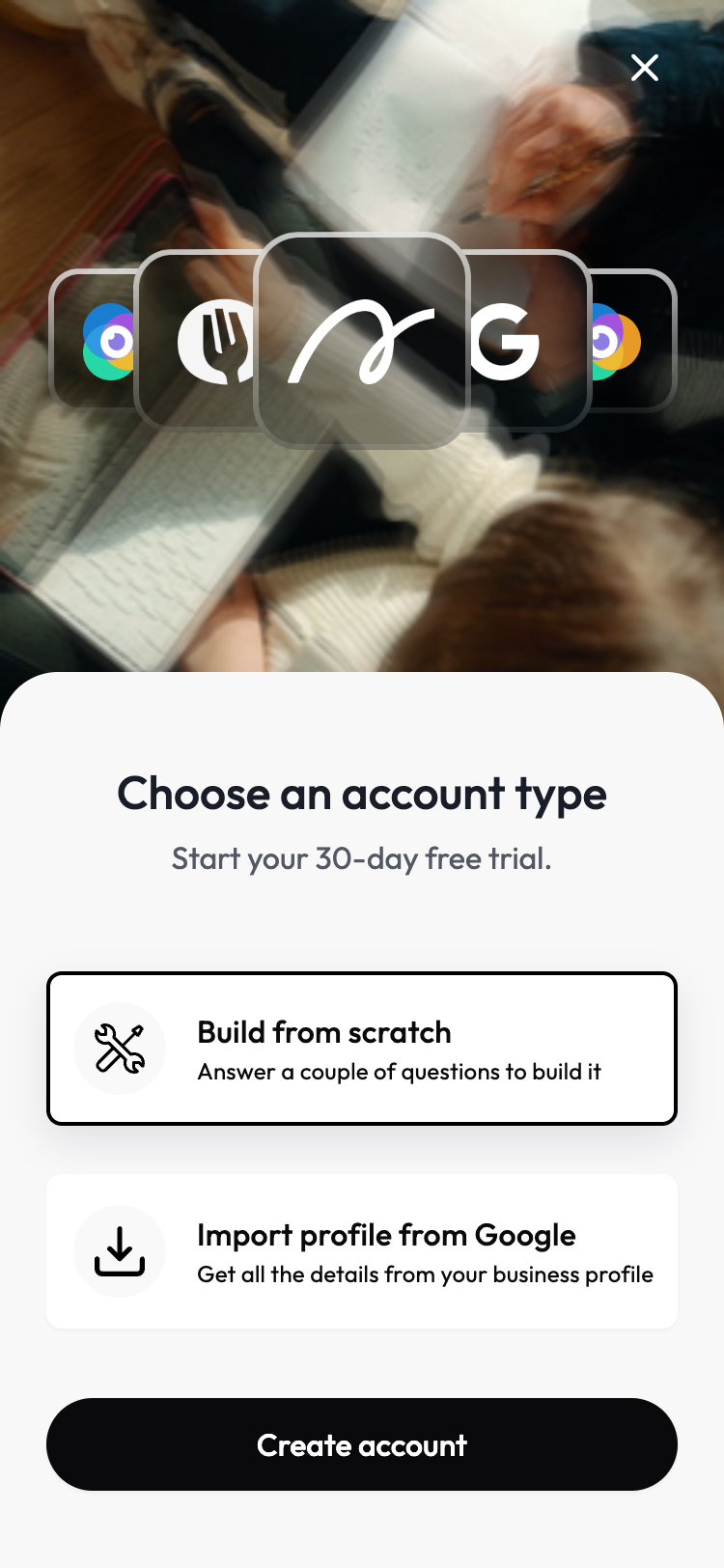
- 01 / 04
Onboarding that feels like it's already working
A choice upfront: build a site from scratch by answering a few questions, or import an existing business profile from Google to pull details in automatically.
- 02 / 04
Purpose first, direction after
Selecting what the website is for, like Restaurants, shapes everything that follows. Recommended categories are surfaced by default, with a free-text option for anything that doesn't fit, so the rest of setup can tailor itself automatically.
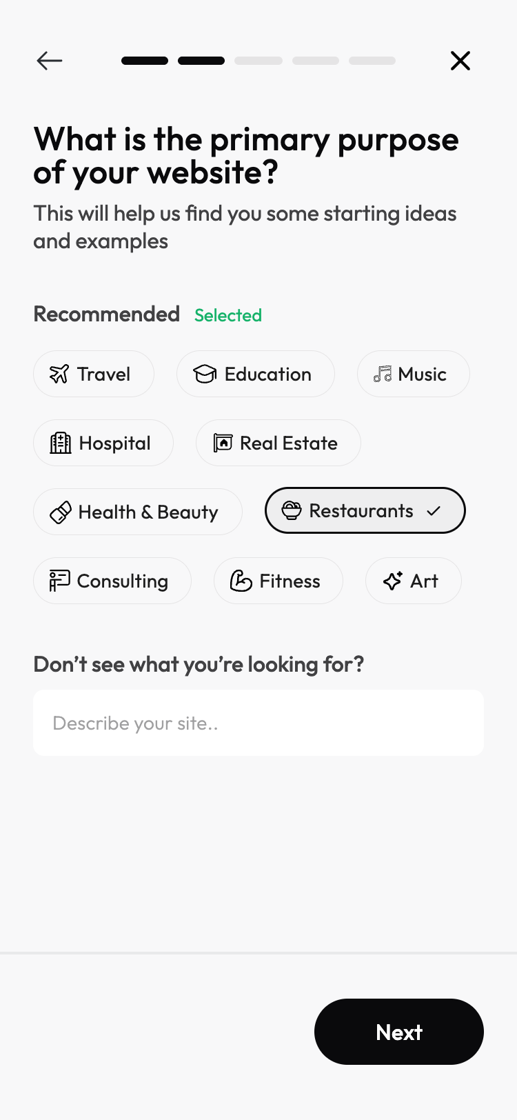
- 03 / 04
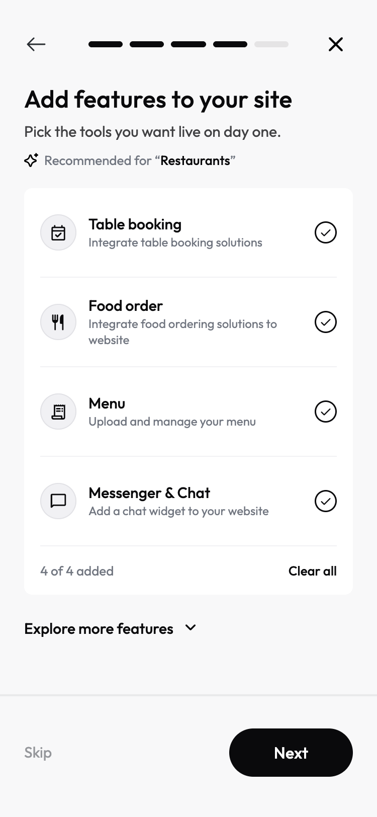
Features suggested, not searched for
Based on the purpose selected, relevant tools are recommended automatically: table booking, food ordering, menu management, messenger and chat for a restaurant. All four are added by default, with room to explore more or skip entirely.
- 04 / 04
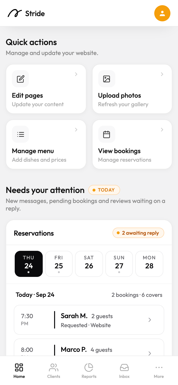
A dashboard built around what needs attention
Quick actions for the most common updates sit right at the top, alongside a section that surfaces what actually needs a response today, like pending reservations, so the owner knows exactly what to do next.
What I didn't get to build
- Pushed for it · Lost
Live previews
I made the case more than once: it's what every comparable platform does, it's the clearest way to show a user their effort is producing something real, and users of those platforms encounter it on desktop even if they mostly work on mobile. The counter-argument was practical and, on its own terms, fair: with ~90% of users on phones and a three-person engineering team, building a pattern most people would never see wasn't a defensible use of bandwidth.
What it cost: the preview wasn't a feature, it was the structural premise for how onboarding screens would be laid out. Losing it meant solving the entire engagement problem through UX alone (sequencing, hierarchy, copy) with no visual payoff to lean on. Much of the redesign above exists because that option was gone.
- Cut for bandwidth
Gamification
Progress mechanics, streaks, animated feedback. Cut for engineering bandwidth and the cost of touching legacy code. Same consequence: no shortcuts to making a long flow feel light.
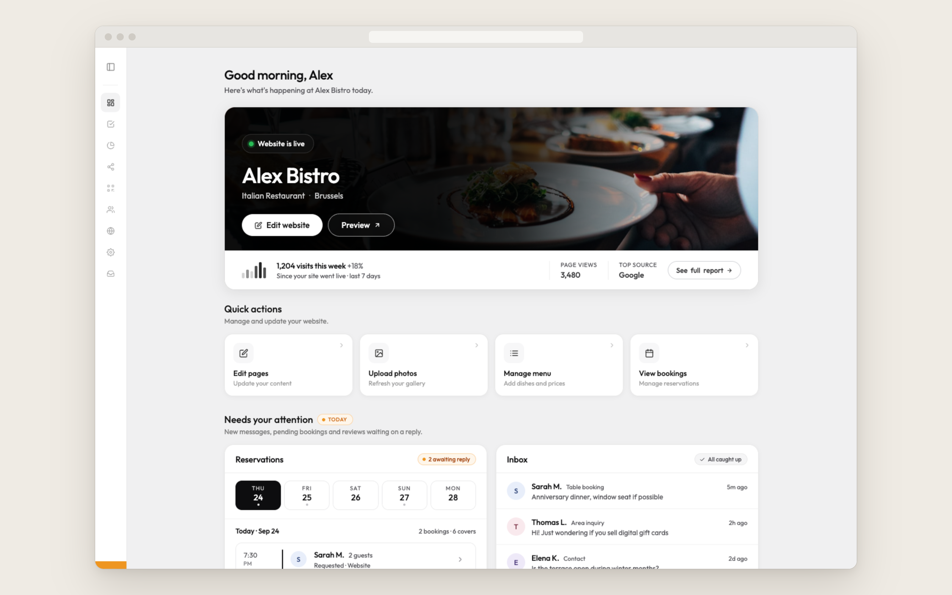
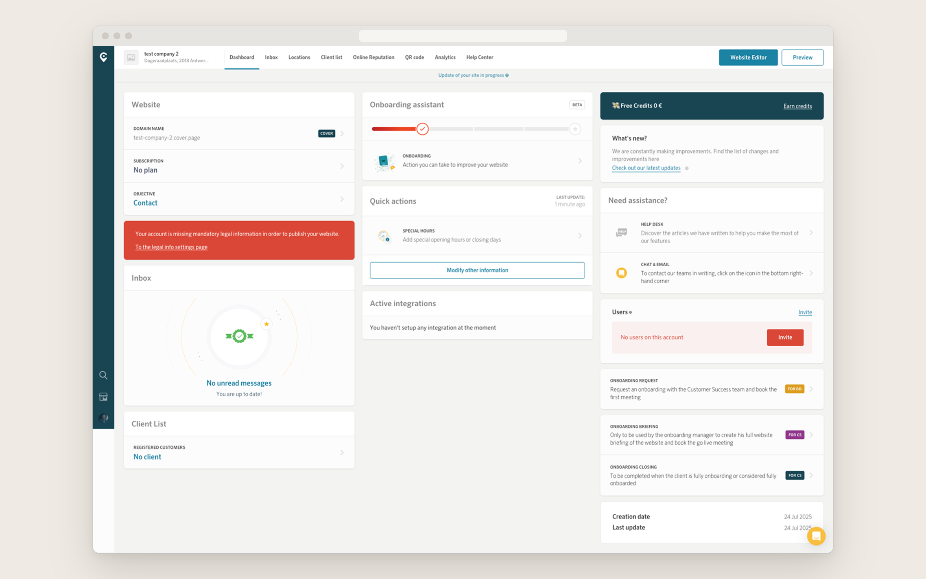
The dashboard, before and after
 BeforeAfter
Reflection
- 01
Best practice is a starting point, not an answer
Fifteen competitor flows and every article said the same thing: shorten it. My users wanted the opposite: length was fine, opacity wasn't. Design advice is written for an average user who doesn't exist.
- 02
When the tool you want gets taken away, check whether you needed it
Losing previews felt like losing the project's spine. It forced me to solve engagement through sequencing and hierarchy instead of visual feedback, and the result is more durable for it, because it doesn't depend on a device capability or an animation budget I was never going to get.
- 03
Placement problems are often existence problems
Moving the help option early failed, moving it late failed, and the two failures had opposite causes, which is the tell. When two opposite fixes break the same way, the assumption they share is the thing that's wrong.
- 04
Show the work, not the intent
The fastest change I made wasn't to the product; it was to how I proposed things. Finished-looking output instead of described ideas turned a slow rejection loop into quick decisions. Ambiguity is expensive when the reviewer is thinking about implementation cost.
Success, measured against the brief
Completion rate, time to finish and drop-off would say whether the screens got better. The company didn't go self-service because onboarding felt clunky: it went self-service to free the sales team and open new countries. So that is what this work is measured against.
Regions the company operates in
When I joined
Today
Next, in the pipeline
- 01
Onboarding was the wall
Sales-led onboarding wasn't just expensive, it was a hard dependency. Opening a country meant hiring people who spoke its language to walk every customer through setup, so market entry moved at hiring speed. Self-service doesn't make onboarding cheaper; it makes it language-scalable. The product does the explaining, in-language, with no one from the company on the call.
- 02
Why the layout had to survive three languages
The English, French and German constraint and this outcome are the same fact from opposite ends: the flow had to work unattended, in markets where nobody from the company would be on the call. The expansion roadmap sat behind one workflow, and that is the workflow I rebuilt.
- 03
A trajectory, not a sprint
Two regions when I joined, six now, three more lined up. Not a one-off lift from a single release, but what the company became able to do across my time there.
Reused
The one-decision-per-screen structure became the model for other flows, including an internal branding flow reworked to match.
Gated
Incomplete websites stopped going live, removing a recurring category of support back-and-forth.
Freed
Onboarding stopped requiring a human by default while keeping one available for anyone who wanted it.